
UX / UI · SERVICE DESIGN · STUDENT PROJECT
Ryanair
Rethinking the self-service check-in experience to make air travel feel clearer, calmer and easier to navigate.

Project overview
Making check-in feel more manageable
The problem
How can we improve the self-service check-in experience and make the journey easier to understand for travellers who may already feel overwhelmed by flying?
The solution
A redesigned self-service experience that breaks the journey into clearer steps and gives travellers a stronger sense of overview and control.
Our contribution
UX Research
UX / UI Design
Service Design
Interaction Design
Research
Understanding the experience beyond the screen
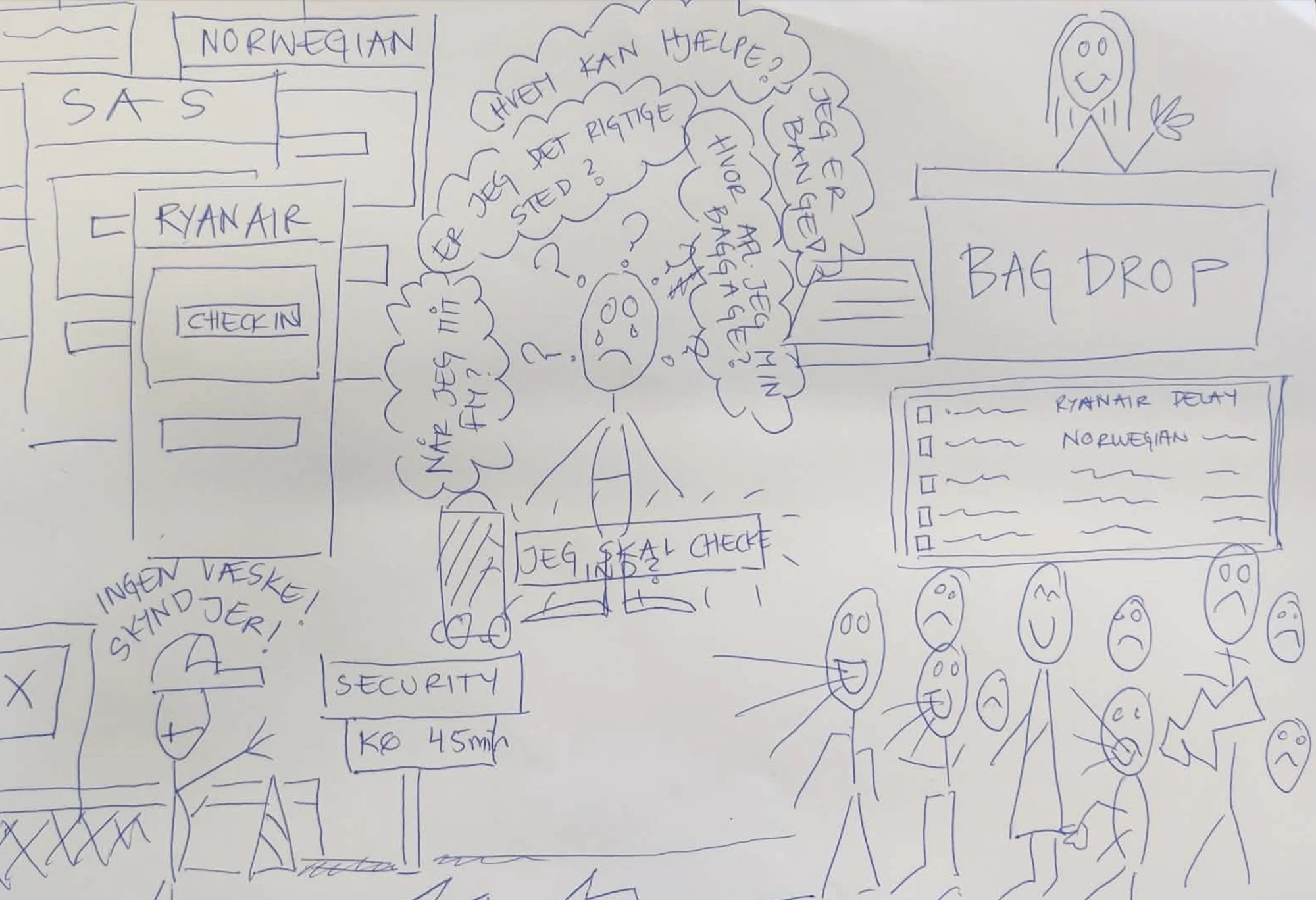
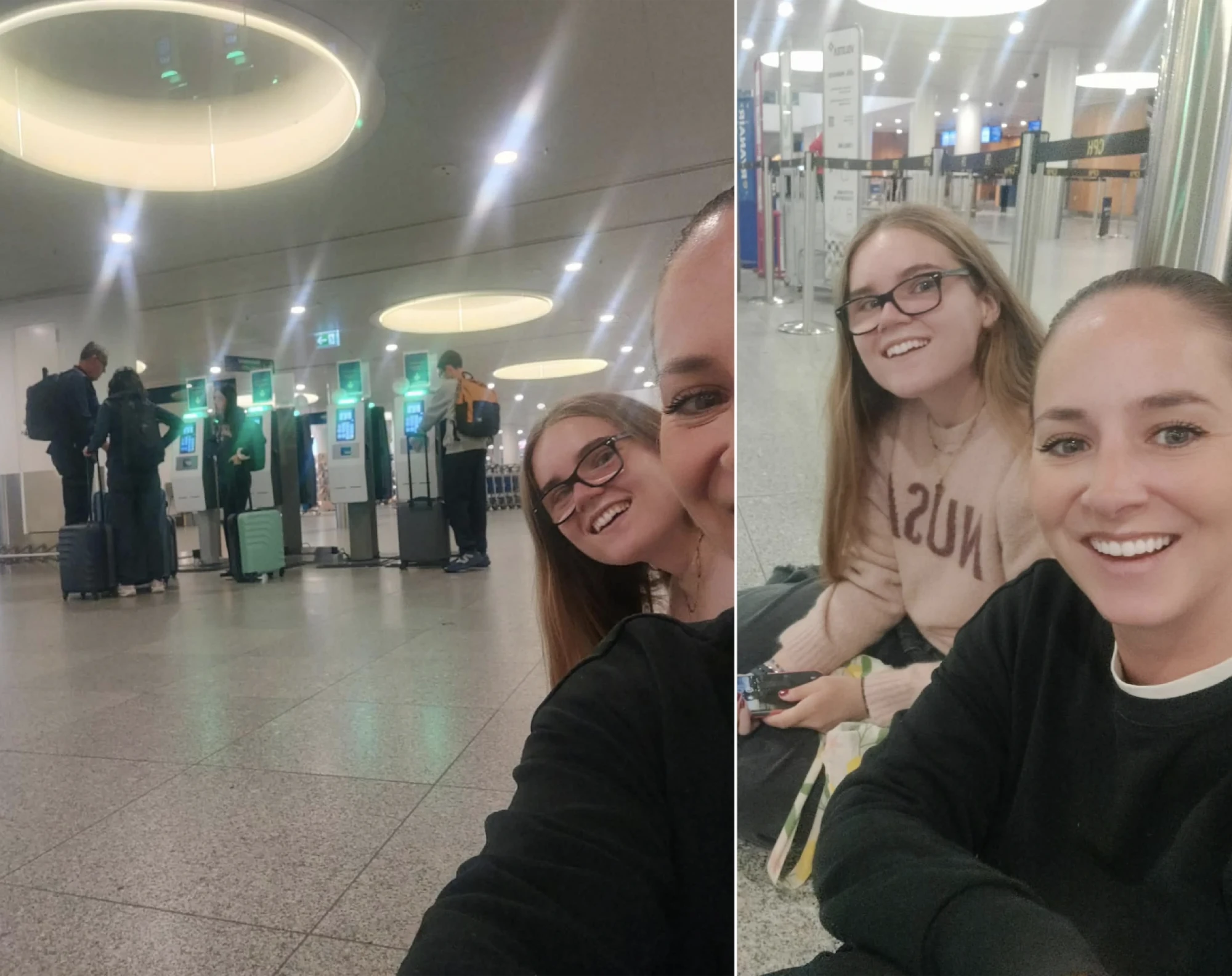
The project began by looking at the check-in experience from the traveller's perspective. Rather than focusing only on the interface, we explored the different touchpoints and moments that shape the overall experience.
Key insights
What we discovered
Information
A complex check-in process can make it difficult for travellers to understand what they need to do and what comes next.
Clarity
Clear instructions, feedback and visible progress can help users feel more confident throughout the journey.
Touchpoints
Information, physical surroundings and service interactions all contribute to the journey.
The concept
One step at a time
The concept focuses on creating a more guided and reassuring check-in experience. Instead of confronting travellers with everything at once, the journey is broken down into clear, manageable steps.
Guide
Give users a clear understanding of where they are in the process and what they need to do next.
Reassure
Use clear feedback and simple communication to reduce uncertainty throughout the check-in journey.
Empower
Give travellers enough information and control to move through the experience at their own pace.
Service design
Designing the whole journey
Customer journey
Mapping the traveller's experience helped identify pain points and opportunities across the journey.
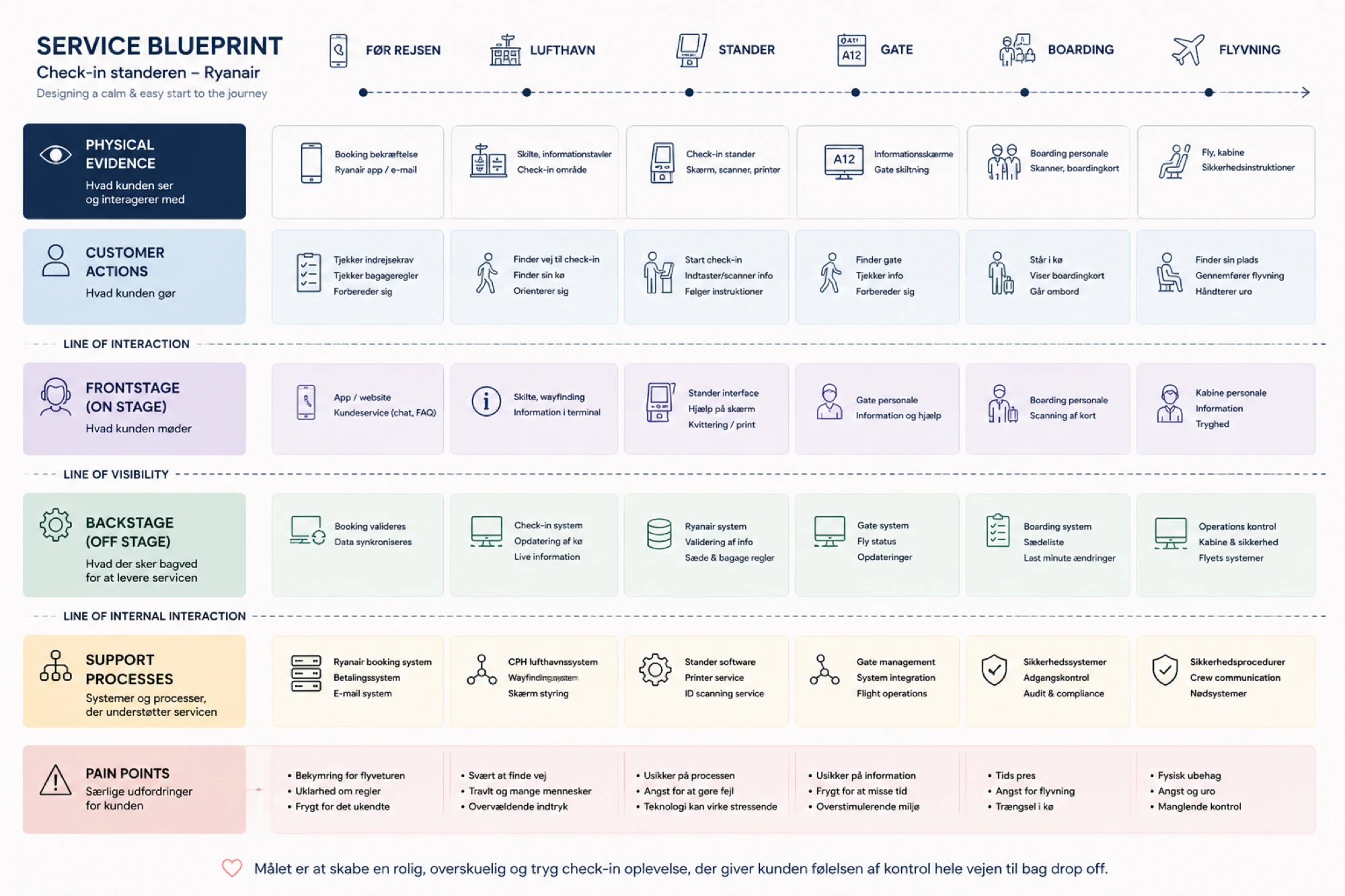
Service blueprint
The blueprint helped connect the visible customer experience with the service processes happening behind the scenes.
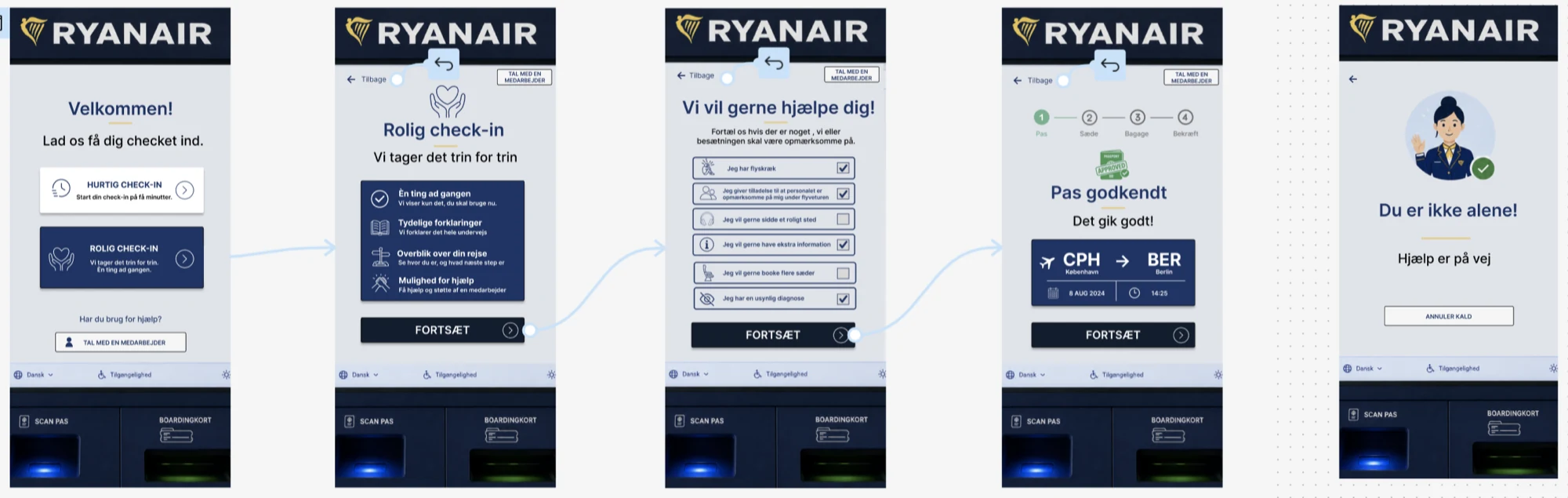
User flow
The redesigned flow focuses on making each step easier to understand and complete.
The redesign
From complex to clear
The interface was redesigned around a clearer hierarchy, simpler decisions and more visible feedback.
Reflection
What we learned
This project taught us to look beyond the interface and think about the experience as a whole. Working with customer journeys, service blueprints and user flows gave us a better understanding of how different touchpoints connect and shape the user's experience. Most importantly, we learned that good UX is not only about making something easy to use, but also about creating a sense of clarity, confidence and control.